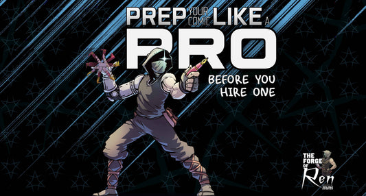
Introduction: The Role of a Comic Book Logo
When people think of a comic book, they usually focus on the artwork and the story. The comic book logo is another critical element that often flies under the radar yet plays a massive role in branding and recognition. A strong logo isn’t just a title; it’s a visual representation of your story’s identity. It’s the first thing readers see and a lasting image they’ll remember long after closing the book.
For indie creators, having a professionally designed logo can make a world of difference. It can help your book stand out, make it more recognizable, and give it a polished, professional feel. But what exactly makes a great comic book logo? And how do you create one that captures your story’s essence? Let’s break it down.
What Makes a Great Comic Book Logo?
A well-designed comic book logo is more than just fancy typography. It blends artistic intent, strategic branding, and functional design. Here are the essential elements that define a strong comic book logo:
1. Readability & Scalability
Your logo must be readable at a glance, whether it’s on a full-sized cover, a social media post, or a tiny app icon. Overly intricate designs might look cool up close, but they can quickly become unreadable when scaled down.
2. Alignment With Story Tone & Genre
Your logo should visually represent the tone and genre of your comic. A horror comic might lean into jagged, distressed fonts, while a superhero story might use bold, dynamic lettering. Consider how your title design sets the mood and reflects the themes of your story.
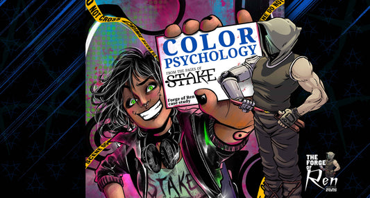
3. Color Psychology & Branding Principles
Colors evoke emotions—and your logo’s color palette plays a key role in how your comic is perceived. Reds and oranges convey energy and urgency, blues and purples feel mysterious, and black-and-white logos offer a timeless, classic vibe. Choose colors that match your story’s tone while ensuring your title leaps off the cover.
Common Mistakes in Comic Logo Design
Even experienced creators sometimes fall into these common traps when designing a comic book logo:
- Overcomplicating the design – Too many details make a logo difficult to reproduce across different formats.
- Poor font choices – Hard-to-read or overly decorative fonts can confuse readers or make the title hard to decipher.
- Inconsistent branding across platforms – Your logo should look consistent across your book covers, social media profiles, merchandise, and promotional materials.

When I first designed the Dusk County Chronicles logo, I made pretty much every mistake I just warned you about.
Overcomplicated Design: The logo had intricate details that looked great on a large cover but lost readability when scaled down. The "Background" was actually part of the logo - making impossible to use in any instance other than the original cover.
Poor Font Choice: The text style looked cool but wasn’t optimized for quick recognition. The fonts also had no pairing relationship, making it feel simultaneously overly complex and simple at the same time.
Lack of Scalability: Through the textures, built in background, and raster foundation, it struggled when used in different formats—on a website, in social media thumbnails, and even on print materials. (read this blog to learn more about raster/vector images)
At the time, I thought I was making something unique and visually striking, but I was actually making it harder for readers to remember and recognize the brand.
I eventually revised and simplified the logo (shown below), applying the same principles we now use when guiding creators through logo development at Metal Ninja Studios. The takeaway?
Your logo isn’t just a title—it’s a first impression. Make it clean, readable, and brand-aligned.
How to Create a Strong Comic Book Logo
1. Choosing the Right Typography
Typography is the backbone of your logo. Custom fonts or hand-drawn lettering can give your logo a unique personality, but make sure readability doesn’t take a back seat. The font should enhance, not overshadow, the story.
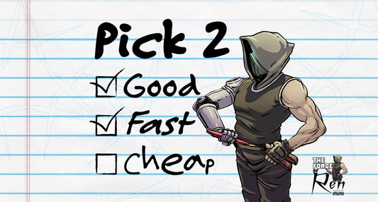
2. Working With a Designer vs. DIY Tools
If you’ve got design experience, you might be comfortable using software like Adobe Illustrator or Affinity Designer to craft your logo. But if design isn’t your strong suit, partnering with a professional ensures you end up with a polished, high-quality result. At Metal Ninja Studios, we specialize in designing custom comic logos that align with your story’s tone and visual identity.
3. Ensuring Print & Digital Compatibility
Your logo should look great everywhere—from oversized convention banners to mobile app previews. Always test how it scales across different sizes and backgrounds to ensure it’s versatile enough for both print and digital formats.
Real-World Examples: Successful Comic Logos
Let’s break down a few iconic comic book logos and why they work:
- Batman – Bold, sharp, and instantly recognizable, perfectly capturing Gotham’s dark and mysterious vibe.
- Spider-Man – Playful and energetic, with a subtle webbed theme that ties directly into the hero’s identity.
- The Walking Dead – Distressed, all-caps lettering that delivers the gritty, survival-horror tone at a glance.
Each of these logos doesn’t just look good—it enhances the comic’s brand identity, making it easier for readers to form an emotional connection.

The final logo for The Dusk County Chronicles, shown above in the most recent anniversary edition rendition, is a much more legible and solid design. The simplicity in the design allows for embellishments or adjustments when needed to match any potential use case.
Through enough consistent practice, repetition, and experience, even the worst logo designs can evolve into strong assets for your comic book series.
How Metal Ninja Studios Helps Creators With Logo Design
At Metal Ninja Studios, we know that your comic book logo is more than just a title—it’s your brand’s handshake with your audience. We work closely with creators to design logos that are:
- Professionally crafted for maximum visual impact.
- Tailored to fit the story’s genre, tone, and personality.
- Versatile enough to work across print, digital, and merchandise.
Whether you’re looking for a bold superhero-style logo or a delicate, hand-lettered design for a fantasy epic, our team is here to help you make a lasting impression.
Conclusion
A great comic book logo is essential for storytelling and marketing. It needs to be readable, genre-appropriate, and visually engaging. Avoid common design mistakes, pay close attention to typography and color choices, and ensure your logo works across multiple formats.
Need a logo for your comic? Book a free consultation with Metal Ninja Studios today! Let’s create a logo that makes your comic unforgettable.