Most comic creators know color matters, but few understand how deeply it can shape a story's emotional experience.
Color isn't just a tool to "make things pop." In comics, it's a psychological force. A well-placed splash of red or a muted wash of gray can completely shift how a reader feels about a moment, a character, or an entire arc. Done right, color drives tone, builds atmosphere, and connects readers emotionally before a single word hits the page.
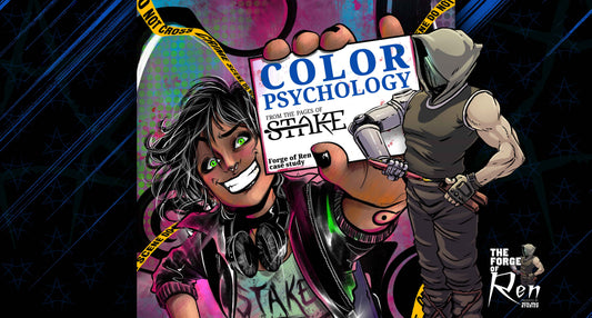
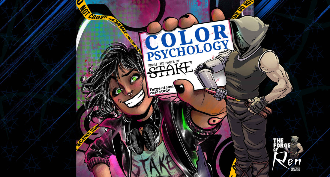
Let's break down how color psychology works in comics—and how you can use it as a storytelling asset. We'll pull real examples from Stake, Volume 1, created by David A. Byrne, Francesca Fantini, and Joel Rodriguez, to show how intentional color choices elevate narrative impact.
🎯 What Is Color Psychology in Comics?
At its core, color psychology is about the emotional and mental associations we attach to different hues. It's not just visual—color hits the nervous system.
Here's a quick breakdown of what some colors typically signal:
- Red = danger, passion, trauma, violence, power
- Blue = calm, sadness, trust, detachment
- Yellow = anxiety, chaos, energy, instability
- Purple = mystery, transformation, the unknown
- Black/white contrast = clarity vs. ambiguity, truth vs. concealment
In comics, where space is limited and the pacing is fast, color often carries an emotional weight that there's no time to explain. A well-designed palette makes your readers feel before they think—and that's the goal.

🎨 Color in Action: Emotional Storytelling in Stake, Volume 1
Stake is an ideal case study for color psychology because it's built on a black-and-white foundation, with color used sparingly and intentionally to enhance emotional beats and narrative weight. Every color splash isn't just for style—it's a signal. It tells the reader, "This matters."
Using color against a grayscale backdrop makes each hue more powerful—more charged. Let's explore how that plays out in key moments.
🔻 Example 1: Blood and Identity

Right out of the gate, Stake sets the tone with a black-and-white world—until the blood hits. Then it's all red, all at once.
The red isn't just visual—it's emotional shock therapy. It anchors the trauma and lets the reader feel the horror of the moment viscerally. And then you see the words "THAT'S ME…" written in that same bloody tone.
This is how you turn backstory into a gut punch: by syncing color, violence, and identity into one overwhelming moment.
💧 Example 2: Fragility Beneath the Surface

This page flips the emotional tone entirely.
Sarah stares back with shimmering, haunting eyes—ringed in blue and yellow, framed by white tears and red-streaked lids. The rest of the panel is stark grayscale, drawing all focus to her expression, where heartbreak, fear, and confusion are written without a single word.
She's just been given a truth that shatters her world, and color becomes the lens through which the reader sees the depth of her internal unraveling. The red around her eyes doesn't signify violence—it underscores emotional rupture. It's raw, vulnerable, and completely human.
This is the power of restraint in color: used precisely, it communicates devastation more clearly than dialogue ever could.
🎮 Example 3: Target Locked, Mentally Frozen

This page highlights a powerful contrast between red and blue, each carrying emotional weight in the narrative.
- The red in the first panel is an emotional callback to Angel's mission—a visual echo of the trauma we saw on Page 1. It re-centers the reader on her purpose and pain.
- The red locator in the second panel quietly drives the plot forward. It's subtle, but it tells us that Angel has a plan, and this is the next step.
Then, a tonal shift:
- The blue that dominates the brain-freeze moment offers levity. It's cool, comedic relief—a necessary breather—and the contrast to red makes the humor pop. It's a brief flicker of lightness in a world otherwise defined by tension.
Here, color does double duty: reinforcing emotional stakes and creating space for balance.
⚔️ Example 4: The Calm Before the Storm

The moment Jessamy enters isn't a burst of triumph—it's a warning, and the color palette reflects that.
- The muddy red sky isn't as saturated as earlier reds in the series. Instead, it feels heavy—like pressure building before a storm. It's not rage, it's restraint. It's not action but inevitability. That subtle tension in the background sets the emotional tone for what's to come.
- And then, Jessamy's yellow eyes—glowing against a scene otherwise drenched in grayscale. Angel is pinned down by two vampires whose tones are muted, their presence visually suppressed. But Jessamy's eyes cut through all of it.
This isn't just an entrance—it's a shift in scale. Her eyes aren't just bright; they're otherworldly. The yellow gives a horror edge, suggesting a force far beyond the others in the room. She's not just another player—she's the one who resets the board.
Once again, no dialogue is needed. The color does the talking.
🧠 Why Color Strategy Matters
Most readers don't consciously think about color while reading, but their brains process it all the time. The saturation, the palette shifts, the recurring emotional tones—they all feed into how a story feels.
Color can:
- Set emotional tone in a single panel
- Signal character growth or regression
- Indicate shifts in time or memory
- Replace exposition with atmosphere
- Guide reader attention across complex layouts
If you think of color as the "final touch," you're missing its narrative potential. Color is not just decoration—it's direction.
🛠️ Want Color to Work This Hard in Your Comic? Start at the Script
The art team rarely overlooks color—but an inexperienced creator often misunderstands it. If you want color to support your story's emotional intent, you must understand how to communicate it.
That starts with grasping the basics of color theory—not to do the job of your colorist, but to explain the emotional beats, tone shifts, and story arcs you want them to enhance.
Want more color tips? CLICK HERE to read more insights from The Forge of Ren!
A creator who knows how color functions narratively can:
- Articulate emotional goals for each scene
- Align character arcs with visual shifts
- Collaborate more effectively across the creative team
At Metal Ninja Studios, our Concept to Comic™ approach brings everyone to the table early, so color isn't just visually effective; it's emotionally precise. The best storytelling happens when everyone's working from the same vision.
✅ Final Thoughts: Use Color Like a Storytelling Weapon
Comics aren't just about what's written or drawn but about what's felt. And color? That's your emotional lever.
When used with intention, color can make a scene hit harder, a character feel deeper, and a story live longer in the reader's mind. As you plan your next project, don't ask, "What colors should I use?"
Ask instead: "What should the reader feel—and how can color get them there?"
💬 Want help turning your story into a fully immersive, emotionally rich comic?
Let's build it right—from concept to comic™.
👉 Book your free consultation with Metal Ninja Studios.